A beautiful reflection on the art of branding by Fabricio Mancebo. With poetic precision and profound clarity, he reminds us that simplicity is not about reduction; it’s about revelation. In a world of visual excess, his perspective brings us back to what truly endures: the quiet power of essential design, the emotional depth of a single gesture, and the courage to let brands breathe.
There is a maxim that I have always followed in my work since I read and learned from Mies Van Der Rohe's “less is more” and Saatchi & Saatchi's “brutal simplicity of thought”.
By Fabricio Mancebo, Iconic Brand Architect & Creative Hacker Turning Bold Ideas into Love Marks
And although they talked about architecture and creative thinking applied to advertising, respectively, it is applicable to all areas of life and our profession and, of course, to the creation of brands and logos.
To feel, not to read: When logos transcend language
There are logos that do not need to be read; they are felt, they express themselves, they conquer your retina. What they do is not “decorate” a brand but contain it and turn it into pure meaning. In its purest form, a good logo not only represents, but reveals and expresses itself. That is why simplifying does not mean taking away, it means letting the soul of a brand be seen, what remains when you eliminate everything superfluous and keep the essence.
Graphic asceticism: The discipline of essential design
Simplicity, in our world of branding, is for me a form of radical honesty, that which is born from the exercise of stripping away the excessive so that the fundamental and the basic can emerge. We could be talking about graphic asceticism, as if when designing a logo, we enter a state where every curve, every absence, every visual silence makes sense. Because in the creation of visual identity, as in Tadao Ando's architecture or Jil Sander's fashion, for example, what is not there also speaks and means something.
A logo is a structure loaded with soul. Like a Romanesque church, austere, but with that light that falls exactly where it should be. Good design is not made to entertain, but to move and transmit, and it is made from the control of the elements, from the analysis of the information, from the mental image that we make full of content, which must be simplified and made real. A well-chosen typography stroke can say more about a brand than any slogan. A subtle graphic gesture can contain an entire story, as Borges did in each of his sentences.
Simplicity is a technique, but it is also an ethic, a stance against excess, against noise, against the ego of designing too much.
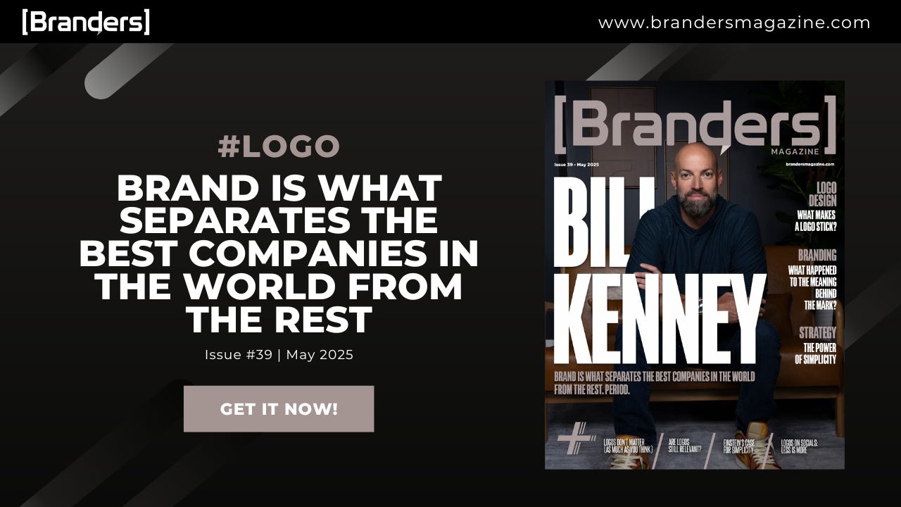
🚨New Issue Alert! #39 Brand Logo
🔎 Inside the Edition
In this issue, we spotlight voices from across the branding world: founders, creatives, and strategists; unpacking one essential question: what gives a brand logo lasting impact in an ever-evolving, cluttered landscape?
🔗 Read now: Brand Logo with Bill Kenney of Focus Lab
🎤 BrandersFest 2025: ORIGIN — Live in New York City
Bold brands don’t just happen, they’re built!
Join the minds shaping what’s next in branding.
🎟️ Only 100 seats. $599 early price is live now.
🎟️ We’re now inviting sponsors and partners to join us in shaping this experience. If your company aligns with bold brand thinking, this is your platform.
📩 Send us an email https://www.brandersmagazine.com/contact
Huge thanks to our contributors, collaborators, and loyal readers. Your passion, insight, and support fuel every edition we publish.
We’re honored to share this space with a community that believes in the power of branding done right. 🙏
📩 Stay in the loop on branding, design, and big ideas—subscribe to Branders on Substack.
Luis Vergara & The Branders Magazine Team
P.S. We’re always listening—drop us a line, share your thoughts, or just say hi!


